Liam Parkinson AS Media Coursework
Thursday 9 May 2013
Double Page Spread Progress
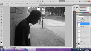 Firstly i had to select the papaer to the size i wanted which was landscape international paper A3. Then i placed the image that i was using onto the page by clicking file, place then seleceting the image. I then fitted it to the size i wanted which was the full page.
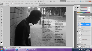 The Next stage was adding in the text for the article. I typed up the article which i had already planned out to write abou the artist i was writing about, then i positioned the text in a colum styled layout like what you see in the majority of magazines. I chose to use black text for my article as it kept to my house style and is easy to read on the page.
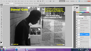 Then i began to add in all the other types of texts such as the pull quote, headline and the description of the article. I chose to use a pull quote as i seen it whilst undergoing my research and i think it is an important part of the double page spread as it lets the reader know what is in the article and leads them on to read it. I also added in another image which is of the same artist in a stuidio recording which relates and fits in well with the article, below this image there is a caption whcih describes the image above. I also placed the 'Hustle' headline which i used on my front cover in the bottom corners of the magazine next to the page numbers which are important as they make things a lot easier for the reader. I chose to use different colored fonts for different parts of the page as i wanted there to be a significant difference between them.
Double Page Spread
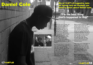 My finsihed double page spread is a main image of Daniel Cole, the image takes up the both pages and acts as the background image. The whole article is about him and his potential in the music industry. The way his personallity is portrayed fits in well with the image. I kept the layout quite simple as apposed to the NME magazine which is quite busy and crowded. The image i used was taken in black and white as i think it compliments the house style.
 The text i used is black for the article and yellow for the headlines, the pull quote is in white text as i wanted there to be a significant difference between the type of texts as they were all different.
I chose to use a pull quote as i seen it in my research in many magazine and i think it is an important factor as it drags the audience in because it is an appealing quote which will make the audience want to read it.
I have positioned the page numbers in the bottom corners of the pages, as this is important to any magazine. Also there is the 'Hustle' text what i used for my headline on my front cover. I seen this in NME, Q & Mojo therefore i decided to do it myself.
I also used a secondary image in the article which i positioned in the middle of the page to the left of the article. This image is Daniel Cole recording in the studio, underneath this image there is a tagline which states what is happening in the picture.
Wednesday 8 May 2013
Double Page Spread Research
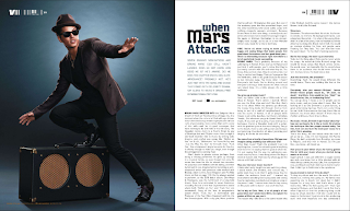 This double page spread is very basic in terms of the layout, personally i think this layout looks more professional compared to a messy, busy layout. The colour scheme of this page is black, white, blue. The lighting of the picture is quite dark which keeps to the house style of the magazine. The headline "When Mars Attacks" this and the image to the left suggests that the article is going to be about bruno mars. The text is in a colum styled layout which looks professional and is easy to read. as apposed to the image the font is quite small, this suggests that the image is more important, possibly to attract more people in. The tone of the magazine is very appealing to the audience as it is telling them a story. There is only one image on the double page spread, which i think looks professional, although i think the article would look better if the image was the background of the double page spread, however then the image would look less important as it would not be as clear. The target audience for this are teenagers/adults due to what they talk about in the article and what termonology is used.
Contents Page Research
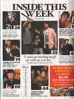1.jpg) This contents page is from NME, it is a very simple, block layout. There is quite a few images on the page which are different sizes, this shows that some articles are more important than others. The majority of the images on the page have not been edited, this gives the images a sense of realism. The fonts for each article are different sizes and font styles which seperates each article from the others, as well as making them stand out in their own way. It also makes everything seem a lot more intresting. The fact that the page numbers are easy to see makes it simpler for the reader to find the story they're looking for. In the bottom right corner there's an advert for a subscription to the magazine with pictures of other front covers and offer, this is displayed in many magazines as it promotes the magazine further. The title of the contents is not simply contents which makes it different and slightly more intresting. There is no competition on offer in this particular contents page, however i will add one into my contents page as it makes it more exciting for the reader.
This contents page is from NME, it is a very simple, block layout. There is quite a few images on the page which are different sizes, this shows that some articles are more important than others. The majority of the images on the page have not been edited, this gives the images a sense of realism. The fonts for each article are different sizes and font styles which seperates each article from the others, as well as making them stand out in their own way. It also makes everything seem a lot more intresting. The fact that the page numbers are easy to see makes it simpler for the reader to find the story they're looking for. In the bottom right corner there's an advert for a subscription to the magazine with pictures of other front covers and offer, this is displayed in many magazines as it promotes the magazine further. The title of the contents is not simply contents which makes it different and slightly more intresting. There is no competition on offer in this particular contents page, however i will add one into my contents page as it makes it more exciting for the reader.Contents Page Progress
I started off with my background image which i then changed the colour to grey as i thought it complimented the house style. Then i added in the title of the magazine in the same style of that on the front cover. I did'nt want to add to much text on to the page as i wanted to keep it simple.
Next thing i done was add in the images, the positioning of these images gave me enough space to write underneath each one for further detail on the article. i did not want to use to many images as it would make the page look crowded and unprofessional.
The next step was adding in the page numbers which i placed at the bottom half of each image. The reason i used red on some and black on others is because due to the image some of the numbers were not visble. therefore i changed the colour's so they were easy for the reader to see.
Finally i added in the text, i kept to the house style and used black and red text as it stands out on the background i have chosen and is easy to read. For the quotes i used black text and for the captions i use red text as i wanted there to be a noticeable difference between the two.
Contents Page
On my contents page i have five images which are linked to the main stories in the magazine. I have also used quotes from the articles as the headline for each articles as i think this is what draws the readers in. Then below each quote i have a said what the article is about. For the text i chose to use black for the quotes and red for the titles, i did this as i wanted there to be a noticeable difference between the two. I have also used page numbers in the bottowm right of each image, i positioned them here as it is then clear to the reader where everything is.
At the bottom left of the page i have a small section dedicated to a subscription advertisment, most magazines do this as it promotes their magazine a little further. I have used my front cover as the advertisment image for the subscription.
In the top right of the page i have a small text box which is advertising a competition, the competition is a chance to record with an artist and the image behind it is an artisit recording in the studio, therfore it fits in perfectly.
Subscribe to:
Posts (Atom)


