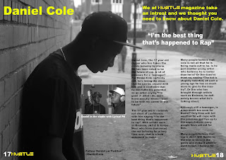
 My finsihed double page spread is a main image of Daniel Cole, the image takes up the both pages and acts as the background image. The whole article is about him and his potential in the music industry. The way his personallity is portrayed fits in well with the image. I kept the layout quite simple as apposed to the NME magazine which is quite busy and crowded. The image i used was taken in black and white as i think it compliments the house style.
 The text i used is black for the article and yellow for the headlines, the pull quote is in white text as i wanted there to be a significant difference between the type of texts as they were all different.
I chose to use a pull quote as i seen it in my research in many magazine and i think it is an important factor as it drags the audience in because it is an appealing quote which will make the audience want to read it.
I have positioned the page numbers in the bottom corners of the pages, as this is important to any magazine. Also there is the 'Hustle' text what i used for my headline on my front cover. I seen this in NME, Q & Mojo therefore i decided to do it myself.
I also used a secondary image in the article which i positioned in the middle of the page to the left of the article. This image is Daniel Cole recording in the studio, underneath this image there is a tagline which states what is happening in the picture.
No comments:
Post a Comment