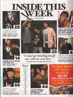
1.jpg) This contents page is from NME, it is a very simple, block layout. There is quite a few images on the page which are different sizes, this shows that some articles are more important than others. The majority of the images on the page have not been edited, this gives the images a sense of realism. The fonts for each article are different sizes and font styles which seperates each article from the others, as well as making them stand out in their own way. It also makes everything seem a lot more intresting. The fact that the page numbers are easy to see makes it simpler for the reader to find the story they're looking for. In the bottom right corner there's an advert for a subscription to the magazine with pictures of other front covers and offer, this is displayed in many magazines as it promotes the magazine further. The title of the contents is not simply contents which makes it different and slightly more intresting. There is no competition on offer in this particular contents page, however i will add one into my contents page as it makes it more exciting for the reader.
This contents page is from NME, it is a very simple, block layout. There is quite a few images on the page which are different sizes, this shows that some articles are more important than others. The majority of the images on the page have not been edited, this gives the images a sense of realism. The fonts for each article are different sizes and font styles which seperates each article from the others, as well as making them stand out in their own way. It also makes everything seem a lot more intresting. The fact that the page numbers are easy to see makes it simpler for the reader to find the story they're looking for. In the bottom right corner there's an advert for a subscription to the magazine with pictures of other front covers and offer, this is displayed in many magazines as it promotes the magazine further. The title of the contents is not simply contents which makes it different and slightly more intresting. There is no competition on offer in this particular contents page, however i will add one into my contents page as it makes it more exciting for the reader.Wednesday, 8 May 2013
Contents Page Research
1.jpg) This contents page is from NME, it is a very simple, block layout. There is quite a few images on the page which are different sizes, this shows that some articles are more important than others. The majority of the images on the page have not been edited, this gives the images a sense of realism. The fonts for each article are different sizes and font styles which seperates each article from the others, as well as making them stand out in their own way. It also makes everything seem a lot more intresting. The fact that the page numbers are easy to see makes it simpler for the reader to find the story they're looking for. In the bottom right corner there's an advert for a subscription to the magazine with pictures of other front covers and offer, this is displayed in many magazines as it promotes the magazine further. The title of the contents is not simply contents which makes it different and slightly more intresting. There is no competition on offer in this particular contents page, however i will add one into my contents page as it makes it more exciting for the reader.
This contents page is from NME, it is a very simple, block layout. There is quite a few images on the page which are different sizes, this shows that some articles are more important than others. The majority of the images on the page have not been edited, this gives the images a sense of realism. The fonts for each article are different sizes and font styles which seperates each article from the others, as well as making them stand out in their own way. It also makes everything seem a lot more intresting. The fact that the page numbers are easy to see makes it simpler for the reader to find the story they're looking for. In the bottom right corner there's an advert for a subscription to the magazine with pictures of other front covers and offer, this is displayed in many magazines as it promotes the magazine further. The title of the contents is not simply contents which makes it different and slightly more intresting. There is no competition on offer in this particular contents page, however i will add one into my contents page as it makes it more exciting for the reader.
Subscribe to:
Post Comments (Atom)
No comments:
Post a Comment