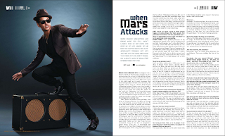
 This double page spread is very basic in terms of the layout, personally i think this layout looks more professional compared to a messy, busy layout. The colour scheme of this page is black, white, blue. The lighting of the picture is quite dark which keeps to the house style of the magazine. The headline "When Mars Attacks" this and the image to the left suggests that the article is going to be about bruno mars. The text is in a colum styled layout which looks professional and is easy to read. as apposed to the image the font is quite small, this suggests that the image is more important, possibly to attract more people in. The tone of the magazine is very appealing to the audience as it is telling them a story. There is only one image on the double page spread, which i think looks professional, although i think the article would look better if the image was the background of the double page spread, however then the image would look less important as it would not be as clear. The target audience for this are teenagers/adults due to what they talk about in the article and what termonology is used.
Wednesday, 8 May 2013
Double Page Spread Research
 This double page spread is very basic in terms of the layout, personally i think this layout looks more professional compared to a messy, busy layout. The colour scheme of this page is black, white, blue. The lighting of the picture is quite dark which keeps to the house style of the magazine. The headline "When Mars Attacks" this and the image to the left suggests that the article is going to be about bruno mars. The text is in a colum styled layout which looks professional and is easy to read. as apposed to the image the font is quite small, this suggests that the image is more important, possibly to attract more people in. The tone of the magazine is very appealing to the audience as it is telling them a story. There is only one image on the double page spread, which i think looks professional, although i think the article would look better if the image was the background of the double page spread, however then the image would look less important as it would not be as clear. The target audience for this are teenagers/adults due to what they talk about in the article and what termonology is used.
Subscribe to:
Post Comments (Atom)
No comments:
Post a Comment