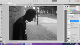
 Firstly i had to select the papaer to the size i wanted which was landscape international paper A3. Then i placed the image that i was using onto the page by clicking file, place then seleceting the image. I then fitted it to the size i wanted which was the full page.
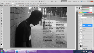
 The Next stage was adding in the text for the article. I typed up the article which i had already planned out to write abou the artist i was writing about, then i positioned the text in a colum styled layout like what you see in the majority of magazines. I chose to use black text for my article as it kept to my house style and is easy to read on the page.
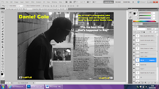
 Then i began to add in all the other types of texts such as the pull quote, headline and the description of the article. I chose to use a pull quote as i seen it whilst undergoing my research and i think it is an important part of the double page spread as it lets the reader know what is in the article and leads them on to read it. I also added in another image which is of the same artist in a stuidio recording which relates and fits in well with the article, below this image there is a caption whcih describes the image above. I also placed the 'Hustle' headline which i used on my front cover in the bottom corners of the magazine next to the page numbers which are important as they make things a lot easier for the reader. I chose to use different colored fonts for different parts of the page as i wanted there to be a significant difference between them.
No comments:
Post a Comment